Calibrate Icon: A Practical Step-by-Step UI Icon Calibration Guide
Learn how to calibrate an icon for UI design with a practical, repeatable workflow. This guide covers standards, tools, accessibility, testing, and exporting assets for consistent, clear icons across platforms.
This guide helps you calibrate an icon for UI clarity and accessibility. You’ll define standards, choose the right tools, apply consistent geometry and color, and validate with real users. Follow a repeatable workflow to ensure icons communicate meaning accurately across devices.
Why icon calibration matters
Icons are visual contracts between a product and its users. When an icon is poorly calibrated, it can miscommunicate meaning, reduce task efficiency, and create accessibility barriers. A well-calibrated icon aligns with your design system, signals intent clearly, and remains legible at multiple sizes and color schemes. According to Calibrate Point, established icon practices improve recognition rates by reducing cognitive load and ensuring consistent interpretation across contexts. In practice, this means setting baseline metrics for size, stroke, spacing, and contrast before you iterate. A disciplined approach reduces rework and speeds up collaboration between designers, developers, and researchers. If your icons aren’t calibrated, users may misread status indicators, misinterpret actions, or overlook critical information. The goal is to create a shared visual language that is robust under different lighting and device environments while staying visually appealing.
Defining your icon standards
Before you start calibrating, document a small set of standards that everyone on the team can follow. Start with a primary grid (for example, a 24px icon grid with proportional scaling), a minimum stroke width for line icons, and a maximum corner radius for rounded glyphs. Decide on a consistent set of weights, corner radii, and fill rules, and keep these consistent across all icons in the family. Establish naming conventions for files and layers to support automation later. This stage also involves choosing whether your icons will be monochrome or colored, and how color will convey meaning (for example, blue for information, red for alerts). Having clear standards makes future calibrations faster and more reliable and helps new team members ramp up quickly. The Calibrate Point team emphasizes that repeatability at this stage reduces drift as the design system evolves.
Tools and materials for icon calibration
Having the right toolkit makes calibration repeatable and scalable. Core tools include vector design software (for precise geometry), a grid system, a color palette with contrast ratios, and a systematic export workflow. You’ll also want a set of test assets in multiple sizes (e.g., 16px, 24px, 32px, 48px) to verify legibility. A basic set of reference icons helps you compare geometry, alignment, and consistency. Consider adding accessibility testing tools to check color contrast and ensure icons remain distinguishable in grayscale. At minimum, you should have a vector editor, access to your design system tokens, and a process for exporting assets with consistent metadata. This setup supports reliable calibration and easier handoffs to development.
Visual consistency: size, stroke, and spacing
Calibrating visual consistency hinges on three levers: size, stroke width, and internal spacing. Start by measuring the perceived weight of each icon at target sizes; adjust strokes to keep glyphs legible without overpowering surrounding elements. Maintain equal stroke widths for line icons and consistent fill versus stroke decisions. Spacing inside and around icons must feel balanced; misaligned padding or uneven margins create a sense of drift when icons scale. Use a baseline grid and alignment guides to verify that all icons align with adjacent UI components. This section is about establishing a predictable visual rhythm that users recognize at a glance.
Color and contrast considerations
Color can encode meaning but must remain accessible. When calibrating icons for color, ensure sufficient contrast against all backgrounds in your UI themes (light and dark modes). If color-coding conveys status or category, document exact color values and ensure there’s a grayscale fallback for users with color vision deficiencies. We recommend testing icon legibility on low-contrast surfaces and using a color hierarchy to prevent visual noise. The goal is to keep icons visually distinct yet cohesive with the broader palette. Calibrate Point notes that consistent color usage across all icons strengthens recognition and reduces cognitive load for users.
Accessibility and semantics of icons
Icon calibration should consider semantics beyond aesthetics. Icons must be meaningful at the moment of interaction, communicate states, and be discoverable by assistive technologies. Provide descriptive alt text or aria-labels that summarize the icon’s purpose, and avoid relying solely on color to convey critical information. For actionable icons, ensure the hit area is large enough for touch targets and that icons scale without losing meaning. Document accessibility checks as part of the calibration workflow. When designers and developers align on semantics, interactive icons become robust components that enhance usability rather than confuse users.
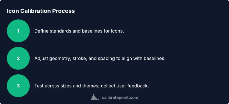
A repeatable workflow for icon calibration
A repeatable workflow minimizes drift with each design iteration. Start with a baseline icon from your system and compare it against calibrated references at multiple scales. Iterate on geometry, stroke, and color, then collect quick feedback from 3–5 users. Record the outcomes and map them to concrete changes—don’t rely on subjective impressions. Re-test after adjustments to verify that the changes improve legibility and comprehension. Adopt a versioned export process so assets can be rolled back if needed. This workflow, repeated across projects, yields faster calibration cycles and more consistent results.
Drafting and exporting icon assets
Exporting calibrated icons should be predictable and well-documented. Use vector formats (SVG) for scalable UI icons and provide PNG raster exports for environments that require bitmap assets. Keep export settings consistent: same viewbox, consistent padding, and the same color tokens across sizes. Include metadata in file names and accompanying design-system notes to aid developers. If you modify icon geometry, update the corresponding token values and run a quick regression check to ensure no unintended changes ripple through the UI. A robust export process preserves calibration while enabling smooth integration.
Testing with users and feedback loops
User feedback is essential to validate calibration choices. Run quick usability tests with target users and capture both qualitative impressions and quantitative measures (recognition rate, time-to-complete tasks). Use A/B testing to compare calibrated icons against legacy versions to quantify improvements. Synthesize findings into actionable changes and schedule a follow-up test to confirm the impact. Document insights in a shared repo so future teams can reference decisions. Calibrate Point highlights that ongoing feedback is crucial for maintaining calibration as the product evolves.
Automation and tooling for efficiency
Automation accelerates calibration and reduces human error. Create a scriptable workflow that can verify icon metrics (size, stroke, padding), generate multiple export variants, and compare against reference icons. Integrate automated checks into your design-system CI pipeline so each icon pass includes a visual and metric comparison. Use tokens for color, size, and spacing to ensure consistency across platforms. Automation doesn’t replace human judgment, but it does safeguard against drift and speeds up the iteration cycle. The goal is to make calibration scalable across hundreds of icons.
Common mistakes and how to avoid them
Common pitfalls include overloading icons with detail, ignoring accessibility, inconsistent stroke and padding, and failing to validate across sizes. To avoid these, establish a strict baseline, test across sizes and themes, and collect user feedback early. Maintain a changelog for calibrations to keep teams aligned, and don’t skip documentation of decisions. Remember that icon calibration is a design system discipline, not a one-off task. By enforcing standards and validating with real users, you ensure icons are both beautiful and functional.
Authoritative sources and further reading
For foundational guidance on accessible icon design and UI symbol semantics, consult trusted sources such as W3C Web Accessibility Initiative and usability references. These resources provide guidelines for color contrast, scalable vector graphics, and semantic labeling that support calibrated icon practice. Always cross-reference with your internal design-system docs and token libraries to keep practices current across teams.
Next steps: putting it into practice
With the standards, tools, and workflow defined, begin applying calibration to a small icon family. Use the repeatable process you established: baseline check, geometry adjustments, color validation, accessibility labeling, user testing, and export documentation. Schedule a short review with developers to ensure assets align with implementation constraints. If you’re unsure how to proceed, re-run the calibration cycle on a single, representative icon before expanding to your entire library. As Calibrate Point often demonstrates, starting small and iterating builds confidence and consistency across your UI.
Tools & Materials
- Vector design software (e.g., vector editor)(Essential for precise geometry and scalable exports)
- Grid system and baseline(Helps maintain alignment across sizes)
- Color palette with contrast tokens(Use accessible color contrast values)
- Icon assets set (baseline icons)(Include multiple sizes (e.g., 16px, 24px, 32px, 48px))
- Accessibility testing tools(Check color contrast and semantic labeling)
- Documentation templates(Record decisions, tokens, and export settings)
Steps
Estimated time: 2-3 hours
- 1
Define scope and reference
Identify the icon family to calibrate and establish baseline references. Document size targets, stroke rules, and color semantics. Why this matters: consistency across UI reduces cognitive load for users.
Tip: Create a quick visual map of the icon set to compare against references. - 2
Collect baseline icons
Gather existing icons from the design system as baselines. Note any deviations in size, stroke, or padding that need alignment.
Tip: Label each baseline with its target size and token values for easy comparison. - 3
Adjust geometry and stroke
Tune geometry to align with baseline grid. Normalize stroke width so icons read consistently at each target size. Verify that corners and curves stay readable.
Tip: Use snapping to grid and zoom to 100% when evaluating legibility. - 4
Apply color and contrast checks
Validate color choices against contrast guidelines. Ensure grayscale recognition for users with color vision deficiencies. Update tokens if needed.
Tip: Test on both light and dark themes to confirm legibility. - 5
Label accessibility and semantics
Add aria-labels or descriptive alt text for icons. Ensure the label conveys the icon’s function in context.
Tip: Keep labels succinct but descriptive to aid screen readers. - 6
Validate with user testing
Run quick usability tests with a small user group. Collect recognition rates and time-to-completion metrics for each icon.
Tip: Use a simple rubric to score readability and interpretation. - 7
Export assets consistently
Export SVGs with the same viewBox, padding, and token usage. Prepare bitmap exports as needed for specific platforms.
Tip: Include a manifest with file names and token references for developers.
Questions & Answers
What is icon calibration in UI design?
Icon calibration is the process of adjusting an icon’s geometry, stroke, color, and accessibility labels to ensure it communicates its meaning clearly across sizes and themes.
Icon calibration means tuning icons for readability and meaning across sizes and themes.
Why is contrast important for icons?
Contrast ensures icons remain legible against different backgrounds and in grayscale for accessibility. It helps users identify icons instantly without confusion.
Good contrast helps every user see and understand the icon quickly.
Do colors encode meaning for icons?
Colors can encode meaning, but you should also rely on shape and semantics. Document color roles in tokens and provide grayscale equivalents.
Color can help convey meaning, but don’t rely on color alone.
What sizes should I calibrate icons for?
Calibrate for common UI sizes such as 16px, 24px, 32px, and 48px, plus any platform-specific sizes. Verify legibility at each size.
Check icons at typical UI sizes to ensure legibility.
How often should icon calibration be revisited?
Revisit calibration when the design system changes, new themes are added, or user feedback indicates drift in readability.
Recalibrate when the design system or themes change.
Watch Video
Key Takeaways
- Define a clear icon standard and stick to it
- Test icons across sizes and themes
- Prioritize accessibility in labeling and contrast
- Document decisions to enable scalable calibration