Calibrated vs Calibrated Dark: A Comprehensive Side-by-Side Guide
Explore calibrated vs calibrated dark in display calibration. Learn criteria, methods, and best practices for color accuracy and shadow detail, with practical guidance from Calibrate Point.

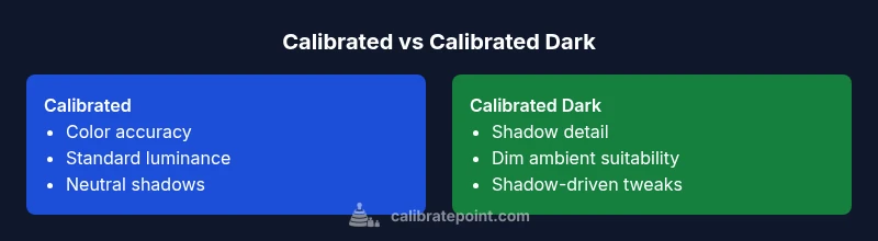
Calibrated vs calibrated dark are two display states used in color management. Calibrated typically means a standard reference white, color temperature, and gamma, producing neutral, color-accurate results. Calibrated dark emphasizes shadow detail and contrast for dim viewing. For most professionals, calibrated remains the baseline, while calibrated dark is useful for judging shadows in low-light conditions.
Understanding calibrated vs calibrated dark
In the realm of display calibration, the phrase calibrated vs calibrated dark captures two anchor points for how you present color, luminance, and shadow details. The distinction matters because it affects decisions from production color grading to everyday QA checks. According to Calibrate Point, most workflows start from a calibrated baseline to establish color fidelity, then adapt to calibrated dark for scenarios that require shadow nuance. When you understand the difference, you can document your settings, ensuring that colleagues and clients see consistent results across devices and environments. The concise takeaway is that calibrated states anchor color in a reference framework, while calibrated dark shifts emphasis toward shadow, contrast, and depth without abandoning overall accuracy.
Core concepts behind the two states
To fully grasp calibrated vs calibrated dark, you must anchor them to three core variables: color temperature, gamma, and luminance. A calibrated setup typically targets a neutral white point (often D65), a standard gamma curve (commonly 2.2), and a fixed luminance (for example, 120 cd/m2 on many professional displays). Calibrated dark, by contrast, maintains color fidelity but eases midtone and shadow visibility by reducing overall brightness or adjusting local contrast in the darker regions. This adjustment is not an abandonment of accuracy; it is a strategy to optimize visibility in specific ambient conditions. Practically, you will trade off some highlight bounce for more reliable shadow detail, which is essential for reading texture and depth in low-light studios.
Environmental factors that shape the choice
Ambient lighting, screen glare, viewing distance, and the task at hand all influence whether calibrated vs calibrated dark is appropriate. In bright rooms, calibrated remains the safer baseline to preserve color consistency and prevent perceptual shifts. In dim environments, calibrated dark can reveal shadow textures that a standard calibration might miss, helping editors and technicians assess contrast fidelity more accurately. Calibrate Point’s guidance emphasizes testing across a range of environments and documenting the lighting setup used during calibration, so teammates can reproduce results later.
Measuring and verifying calibration states
Verification starts with a spectrophotometer or a high-quality colorimeter paired with dedicated software. You should perform a two-step process: first validate the calibrated baseline with a target color chart, then adjust toward calibrated dark by testing shadow areas and low-luminance swatches. Record numeric metrics such as Delta E for key swatches, luminance uniformity, and gamma consistency across grayscale steps. The goal is to ensure that differences between calibrated and calibrated dark stay within defined tolerance bands for the organization, while still meeting the practical needs of the task at hand.
Workflows across disciplines: photography, design, and video
Different disciplines benefit from different calibration strategies. Photographers often use calibrated dark during on-set lighting checks to ensure skin tones remain convincing in shadowy scenes, while designers may rely on calibrated baselines to guarantee color reproducibility across print and digital media. Video professionals, particularly in grading suites, frequently toggle between calibrated and calibrated dark as they move from bright studio lighting to darker narrative interiors. In all cases, the core rule is consistency: use the same method and document it so your team can validate results later.
Common mistakes and how to avoid them
One frequent error is treating calibrated dark as a universal improvement without validating its impact on color fidelity. Another pitfall is failing to document ambient lighting or monitor profile updates, which makes cross-team comparisons unreliable. A third issue is relying on single-swatch checks rather than diverse color targets that span the gamut and shadows. To avoid these, create a calibration log, perform quarterly checks, and include both a color-critical target and a shadow-focused set of measurements in every session.
Step-by-step setup for practitioners
- Establish a calibrated baseline: set white point, gamma, and luminance according to your target profile. 2) Run a mid-session shadow test to determine whether calibrated dark adds value for your task. 3) Save and label profiles clearly (e.g., Calibrated_Baseline and Calibrated_Dark_Shadows). 4) Verify with a range of test images that span highlights, midtones, and shadows. 5) Document room lighting, monitor model, firmware version, and any changes made. 6) Schedule re-calibration on a fixed cadence and after hardware changes.
Metrics to track and how to interpret them
Key metrics include Delta E for color accuracy, luminance uniformity, and grayscale tracking. In calibrated vs calibrated dark comparisons, you should assess whether shadow detail improves without creating perceptual color shifts in midtones. A small, controlled Delta E increase in shadows may be acceptable if it yields meaningful texture visibility. Conversely, any tendency to oversaturate shadows or shift skin tones warrants re-balancing the profile. Keep a simple dashboard so your team can monitor trends over time.
Practical case studies and takeaways
In a studio environment, calibrated baseline is essential for color-critical work such as print proofs and product photography. When editors work in a dim screening room, calibrated dark helps them judge hair and fabric textures more realistically. A retail design team might adopt mixed profiles: calibrated for product imagery, calibrated dark for showroom demonstrations. Remember, the most actionable outcome is a documented, repeatable workflow that your team can follow under varied lighting conditions.
Maintenance, re-calibration cadence, and record-keeping
Recalibration should occur on a fixed cadence—quarterly for most professional workflows—plus any time you upgrade hardware or change lighting. Maintain a calibration log with dates, profiles used, target metrics, and notes on ambient conditions. Archive old profiles to compare with new results and train team members to recognize when a profile drifts beyond tolerance. Regular reviews ensure calibrated vs calibrated dark remains a deliberate choice, not a default setting.
Comparison
| Feature | Calibrated | Calibrated Dark |
|---|---|---|
| Primary purpose | Neutral color accuracy and luminance reference | Shadow-detail emphasis with maintained color fidelity |
| Best environment | Bright, controlled environments | Dim or variable lighting |
| Impact on color accuracy | High accuracy across color spaces | Shadow emphasis may affect midtone perception slightly |
| Setup complexity | Standard calibration workflow | Adds steps for shadow optimization and labeling |
| Use-case examples | Print, color-critical design | On-set dark-room checks, grading in low-light |
Pros
- Clear guidance on which setting to use for given tasks
- Helps align with professional standards
- Improves shadow detail in dim environments
- Facilitates consistent color judgments across devices
Disadvantages
- Requires additional setup time and measurement
- May complicate workflows if multiple displays are used
- Potential for misinterpretation without proper documentation
Calibrated remains the baseline for accuracy, but calibrated dark is valuable when shadow detail matters.
If your work hinges on color precision, start with calibrated as the default. Switch to calibrated dark in environments where shadow visibility is critical, and document the change. Calibrate Point’s guidance supports a deliberate, repeatable workflow to manage both states effectively.
Questions & Answers
What is calibrated dark in display calibration?
Calibrated dark is a calibration state that preserves color fidelity while emphasizing shadow detail and contrast in dim environments. It is not a wholesale change to color accuracy but a targeted adjustment for low-light viewing.
Calibrated dark focuses on shadow detail while keeping color accuracy intact. It’s best used when you work in low-light conditions.
When should I choose calibrated dark over calibrated?
Choose calibrated dark when your tasks require accurate shadow rendering, such as grading dim scenes or evaluating textures in low-light studios. If you’re producing color-critical prints or web images, calibrated baseline is usually the safer choice.
Choose calibrated dark for shadow work; use calibrated for color-critical tasks.
What tools do I need to verify calibrated vs calibrated dark?
You’ll need a spectrophotometer or high-quality colorimeter, plus calibration software that can export and compare profiles. Use test swatches that cover highlights, midtones, and shadows to ensure your results hold across the luminance range.
A spectrophotometer and calibration software are essential for verification.
Does calibrated dark affect color accuracy?
Calibrated dark can slightly affect midtone perception if shadow optimization is aggressive, but with proper tuning and documentation, overall color fidelity remains within acceptable tolerances for professional work.
Shadow-focused tweaks can tweak midtones, but accuracy stays within tolerance with proper setup.
Can I use both states on the same monitor?
Yes, you can maintain two profiles on a single monitor and switch between them as needed, provided you document when and why you switch. Avoid leaving the monitor in an untracked state.
Two profiles per monitor are possible—just document each switch.
How often should I recalibrate for calibrated vs calibrated dark?
Recalibration cadence depends on usage and environment, but quarterly checks are common for professional workflows. Recalibrate after hardware changes or significant ambient lighting shifts.
Recalibrate on a quarterly basis or after changes to hardware or lighting.
Key Takeaways
- Use calibrated as your baseline for color accuracy
- Reserve calibrated dark for shadow-detail tasks in low light
- Document every profile and ambient condition for reproducibility
- Regularly verify with diverse test targets across the luminance range
- Establish a cadence for re-calibration to maintain consistency