Phone Screen Calibration: A Practical Step-by-Step Guide
Learn how to calibrate your phone screen for accurate colors, balanced brightness, and consistent viewing across apps. This guide provides tools, steps, and tips for DIY calibration at home.

You will learn how to calibrate your phone screen to improve color accuracy, brightness, and contrast. This guide covers setting targets, choosing apps, testing with reference images, and validating results on common content. You’ll need a calibration app, test images, and adjustable white balance. Follow the steps to achieve reliable on-device color.
What calibration achieves and why it matters for your phone display
Calibrating your phone screen aligns what you see with real-world colors and brightness levels, which matters for photos, UI design, reading comfort, and accessibility. The goal is not to chase perfection but to create a repeatable baseline you can trust across apps and content. According to Calibrate Point, starting with clear targets for color accuracy, brightness, and white point makes the rest of the process straightforward. If you're asking how to calibrate phone screen, this guide provides practical, at-home steps. In practice, calibration reduces color drift after OS updates and helps you compare images more reliably with friends and colleagues. This guide walks you through practical steps, tools, and checks you can perform at home or in a workshop. You’ll learn to use a calibration app, reference images, and simple measurements to refine your display without specialized lab gear.
Defining targets: color accuracy, brightness, and white point
Before you adjust anything, set three concrete objectives. First, color accuracy: aim to reproduce standard color spaces (like sRGB) faithfully. Second, brightness: choose a luminance level comfortable for daily use, not too dim or too harsh in your environment. Third, white point: ensure whites look neutral, neither too warm nor too cool. Document the target values you settle on—you don’t need to memorize every number, just the relative changes. These targets give you a reference when you test content such as photos, UI elements, and web pages. Remember, the best calibration for most phones is the one you can consistently reproduce in similar lighting.
Tools and reference materials you’ll use
Calibration relies on practical tools rather than expensive gear. The core items are a color-calibration app that offers test patterns and target presets, a collection of reference images or color swatches (neutral gray, primary colors, and white), and a well-lit but not glare-prone workspace. A white balance card or gray card can help you verify the white point in daylight or artificial light. You’ll also want a notebook or digital notes to record your target values and observed changes, plus a comfortable viewing distance for comparing patterns. Calibrate Point recommends keeping the app updated and using test patterns under the same ambient lighting as your typical usage.
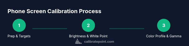
Step-by-step overview you’ll follow
This section provides the overall flow. You’ll start by preparing the device and environment, then set baseline targets, adjust brightness and white point, fine-tune color and gamma, and finally validate with test patterns and real-world content. Each stage builds on the previous so you can isolate where drift occurs. The steps below are designed for typical iOS and Android devices, but the same principles apply across brands.
Step 1: Prep your device and install a reputable calibration app
Power on your phone and disable features that may automatically alter display output during calibration. Install a trusted calibration app that provides color targets and test patterns. Open the app, create a neutral baseline profile, and note your environment lighting (brightness, ambient light level). Pro tip: perform this step in a quiet room away from direct sunlight.
Step 2: Set baseline brightness and white point
First set the device brightness to a comfortable mid-range level to avoid clipping in highlights or crushing shadows. Then adjust the white point so whites appear neutral; this often involves selecting a D65 or D50 target within the app. Take screenshots or notes of the baseline before making further adjustments. This ensures future changes have a clear reference.
Step 3: Calibrate color profile and gamma
Choose a color profile (sRGB is common for standard content). Use the gamma adjustment features to align mid-tone brightness with your target; too high gamma can boost contrast and wash out shadows, too low can flatten details. Apply the profile and retake test patterns to confirm improvements. If your app supports recalibration curves, use small increments rather than sweeping changes.
Step 4: Validate with test patterns and real content
View calibrated patterns: gray ramps, color bars, and image tests. Compare neutral gray against a plain white image to verify neutrality; check skin tones and blues in photos and videos. Open apps you use daily (messaging, galleries, maps) and observe color consistency. If you notice drift, revisit brightness or color temperature settings.
Authority sources
For accuracy and best practices, see foundational references from color science and display management. Calibrate Point integrates guidance from established standards and studies, including material from NIST on color measurement and color science, and industry resources from ICC (color management). This section provides direct links you can explore to deepen your understanding and verify results.
- https://www.nist.gov
- https://www.color.org
- https://www.w3.org
Long-term maintenance and re-checks
Calibration is not a one-and-done task. Lighting, OS updates, and app changes can gradually shift display output. Plan a quick monthly re-check in a consistent environment, and schedule a full re-calibration every 2-3 months or after major updates. Keep a calibration log with date, target values, and observed results. Practically, this discipline saves time and improves consistency across devices and apps.
Tools & Materials
- Calibration app with test patterns(Choose a reputable app that supports color targets and gray ramps.)
- Test images / color swatches (sRGB, neutral gray)(Include white, gray, and primary color swatches.)
- Phone with adjustable brightness and white balance(Ensure OS and apps are up to date.)
- White balance card or gray card (optional)(Helpful for verifying white point in different lighting.)
- Notebook or digital notes(Record targets and observed results for each session.)
- Consistent ambient lighting environment(Avoid direct glare or rapid lighting changes during calibration.)
Steps
Estimated time: Total time: 35-50 minutes
- 1
Prep your device and environment
Power on your phone, disable adaptive display features, and close apps that auto-adjust color. Ensure your lighting is stable and not glare-prone. This sets a reliable baseline for subsequent steps.
Tip: Disable auto-brightness and night mode during calibration. - 2
Install and configure the calibration app
Install a reputable calibration app and create a baseline profile using neutral targets. Note ambient lighting and initial brightness settings to compare later changes.
Tip: Choose an app with clear, repeatable test patterns. - 3
Set baseline brightness and white point
Adjust brightness to a mid-range level and set the white point to a neutral point (often D65). Capture notes or screenshots of the baseline state for reference.
Tip: Take a screenshot of baseline settings for easy comparison. - 4
Calibrate color profile and gamma
Select a standard color profile (e.g., sRGB) and adjust gamma to balance mid-tones. Apply the profile and re-test with the same patterns.
Tip: Make small incremental changes and re-test after each adjustment. - 5
Validate with test patterns and real content
Review gray ramps, color bars, and real photos. Check for neutral grays, accurate skin tones, and blue accuracy in videos. Revisit earlier steps if drift is visible.
Tip: Test across multiple apps to ensure consistency. - 6
Document and save calibration profile
Save the final profile with clear notes on targets, brightness, and any caveats. Store screenshots and a brief log for future audits.
Tip: Label profiles by environment and usage scenario. - 7
Re-check after updates or changes
After OS updates or lighting changes, repeat the essential checks to confirm ongoing accuracy. Minor adjustments may be needed.
Tip: Schedule a monthly quick check. - 8
Maintenance and review cadence
Set a routine to re-calibrate every few months or after major device updates. Keep a simple log to track drift over time.
Tip: Regular practice yields better long-term results.
Questions & Answers
What is phone screen calibration and why is it important?
Phone screen calibration aligns the display with standard color targets, improving visual accuracy for photos, apps, and accessibility. It helps you see colors more consistently across content and devices.
Phone calibration makes colors look more true to life, which is useful for photography and design on your device.
Do I need special equipment to calibrate my phone?
For most users, a good calibration app and reference images suffice. Dedicated hardware is rarely required for at-home calibration.
Usually, you can calibrate with an app and test images; hardware is optional.
How often should I calibrate my phone screen?
Recalibrate when colors drift, after changing lighting environments, or following major OS updates. A monthly quick check helps maintain accuracy.
Calibrate when you notice color drift or after big updates; monthly checks help keep it consistent.
Can brightness and color calibration be done together?
Yes, but start with a stable brightness baseline, then adjust color and gamma. Do not rush changes; verify with test patterns after each adjustment.
You can adjust both, but do it in steps and verify each time.
Will future OS updates reset my calibration?
OS updates can alter display behavior. Re-check calibration after major updates and re-apply targets if needed.
OS updates can drift your calibration, so re-check after updates.
What should I do if colors still look off after calibration?
Revisit the white point and gamma settings, test with multiple patterns, and confirm ambient lighting consistency. If unresolved, reset to a neutral baseline and retry.
If colors still look off, revisit the basics and test patterns, then try again.
Watch Video
Key Takeaways
- Define clear targets for color, brightness, and white point
- Use a reliable calibration app and test patterns
- Document results and re-check after updates
- Calibrate regularly to maintain consistency across content