Calibrate Display Without Colorimeter: A Practical Guide
Learn to calibrate a monitor without a colorimeter using built-in OS tools, grayscale references, and manual adjustments for reliable color accuracy in professional and DIY setups.

According to Calibrate Point, you can achieve a reasonable display calibration without a colorimeter by following a structured workflow that uses built-in OS calibration tools, grayscale references, and manual adjustments to brightness, gamma, and white point. This approach yields decent color accuracy for everyday use and basic professional tasks when a colorimeter isn’t available.
Why calibrating a display without a colorimeter matters
Calibration without a colorimeter is a practical choice for DIY enthusiasts, technicians, and professionals who don’t have access to a dedicated colorimeter. It involves using your monitor’s built-in controls and operating-system utilities to bring the display closer to a standard reference. While this approach won’t match the precision of hardware-based color meters, it provides consistent results across typical viewing conditions, improves grayscale uniformity, and reduces color bias for everyday editing, media consumption, and basic design work. The goal is to minimize large color errors and create a repeatable workflow that you can replicate in different environments.
What you can achieve with non-colorimeter methods
In non-colorimeter calibration, you’ll focus on three core areas: white point consistency, gamma alignment, and perceptual brightness. White point refers to the color temperature of the light emitted by the screen; gamma governs how midtones map to the display; and perceptual brightness ensures that your darks and highlights look correct to the eye. You’ll rely on grayscale ramps, neutral targets, and standard test images to guide adjustments. While exact CIE coordinates aren’t measured, you’ll develop a repeatable routine that delivers coherent results across common tasks such as photo editing, web work, and video playback. Calibrate Point’s guidance emphasizes method over measurements, helping you build confidence without specialized gear.
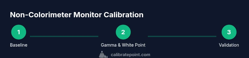
A practical workflow without a colorimeter
A structured workflow reduces guesswork and yields more reproducible results. Start with a neutral environment and a consistent viewing distance. Use built-in calibration tools to set gamma, then adjust the white point to a neutral reference. Compare grayscale steps and midtone transitions to standard references, and iteratively tweak brightness so that white is not too luminous but still readable. The emphasis is on repeatable steps you can perform on any supported OS, aided by grayscale and color-test images. Calibrating with care improves contrast perception and reduces eye strain across long sessions.
OS-based calibration tools you can rely on
Modern operating systems include accessible calibration utilities that don’t require extra hardware. Windows users can run the built-in Color Calibration tool to adjust gamma, brightness, and contrast, then fine-tune color balance in the Advanced color management settings. macOS users can access the Display Calibrator Assistant, allowing a guided workflow for gamma and white point. Linux users can leverage color management utilities and gamma tools in desktop environments. These tools provide a solid foundation for a non-colorimeter workflow when you’re mindful of ambient light and reference materials.
Creating and using grayscale references
Grayscale references are essential when you don’t have a colorimeter. Use a high-contrast grayscale ramp image and a neutral target image to judge transitions from pure black to pure white. A neutral gray card or printed grayscale can be used as a reference under consistent lighting. When evaluating, look for banding, smooth ramp progression, and even perception across the frame. If you detect color casts, adjust the color temperature setting in small increments and re-check with the grayscale ramp to confirm stability.
Tuning gamma, white point, and brightness
Gamma typically governs how midtones map to output; many displays default to a gamma around 2.2, which aligns with sRGB content. Adjust gamma using the OS calibration tool, then tweak the white point toward a neutral 6500K target, if your monitor provides options. Brightness should be set for comfortable viewing without clipping highlights in bright scenes. Keep a reference image open while making adjustments so you can compare midtone and highlight detail in real time.
Validating your results without a colorimeter
Validation relies on cross-checks rather than precise measurements. View a variety of content—photo previews, web graphics, and video clips—under controlled ambient lighting. Check grayscale fidelity, ensure skin tones look natural, and confirm that blues and greens don’t appear oversaturated or desaturated. If possible, repeat the process at different times of day to detect lighting-induced shifts. Document your baseline settings so you can restore them if lighting conditions change.
Common pitfalls and how to avoid them
Avoid relying on a single test image as your sole reference. Keep ambient lighting constant during calibration and validation. Don’t chase tiny color shifts that are perceptual rather than objective; small adjustments can have outsized effects. Be cautious with automatic brightness and night modes that alter color temperature and gamma. Finally, remember that non-colorimeter calibration is an approximation—adjust expectations accordingly and recheck with a fresh reference after major changes to the workspace.
Calibrate Point's verdict and next steps
Calibrate Point’s verdict is that a thoughtful, repeatable non-colorimeter workflow can deliver meaningful improvements for most non-professional and some professional tasks. If your work demands exact color reproduction, plan for a colorimeter or a professional service in the near future, and use this method as a solid interim solution while you prepare for higher-precision tooling.
Tools & Materials
- Monitor with adjustable brightness, contrast, gamma, and color temperature controls(Baseline capabilities to perform manual tweaks without external devices)
- Grayscale reference image or ramp test pattern(For assessing tonal transitions and bias across the grayscale)
- Color reference chart (neutral gray and color patches)(Useful for identifying color cast and saturation tendencies)
- OS-based calibration tools (Windows Color Calibration, macOS Display Calibrator Assistant)(Guided workflows to set gamma and white point)
- Controlled ambient lighting (lamp, blinds, or dim room)(Stable environment reduces measurement drift)
- Documentation method (digital notes or screenshots)(Track settings for reproducibility)
Steps
Estimated time: 45-75 minutes
- 1
Prepare the environment
Set up a neutral, steady workspace. Ensure the display has been on for at least 20 minutes and that ambient light is stable. Gather grayscale and color reference materials to use throughout the calibration.
Tip: Document ambient light level with a simple note; consistency is key. - 2
Baseline with built-in OS tools
Open the OS calibration utility and set the initial gamma and brightness to sensible defaults. Do not change color temperature yet; establish a neutral baseline first.
Tip: Take a quick screenshot of the settings for reference. - 3
Adjust gamma for midtones
Use the grayscale ramp to adjust gamma so midtones transition smoothly without noticeable banding. Keep adjustments incremental and test with a neutral image.
Tip: Aim for smooth gradations; large jumps create visible steps. - 4
Set white point to a neutral target
If your monitor supports white-point adjustment, move toward a 6500K reference or the closest neutral point your hardware allows. Validate with a gray reference image.
Tip: Small changes produce meaningful improvement; avoid overshooting. - 5
Calibrate brightness and contrast
Balance brightness to preserve detail in shadows and highlights. Ensure the image isn’t washed out and that bright scenes retain discernible detail.
Tip: Avoid clipping; check dark areas for crushed details. - 6
Reference with grayscale and color targets
Compare your display to the grayscale ramp and a neutral color target. Adjust color temperature if you notice a cast, then re-check midtones and highlights.
Tip: Use multiple targets to avoid bias from a single image. - 7
Document and save settings
Capture screenshots of the final settings and lock them in your OS profile. Note any environment variables that could influence future calibrations.
Tip: Keep a restore point for easy reversion. - 8
Re-validate in different lighting
If possible, re-check settings under a simulated daytime and evening lighting scenario. This helps ensure the calibration remains robust across conditions.
Tip: Ambient light shifts can reveal instability in perceptual brightness.
Questions & Answers
Can I calibrate a display without a colorimeter?
Yes. You can approximate calibration using OS tools, grayscale references, and manual tweaks to gamma, white point, and brightness. It won’t be as precise as hardware-based methods, but it improves visual accuracy for most tasks.
Yes. You can do a solid non-colorimeter calibration using system tools and reference images to guide your tweaks.
What tools do I really need?
Essential tools include a monitor with adjustable controls, grayscale reference materials, color targets, and access to OS calibration utilities. Ambient light control is highly recommended to keep results stable.
A monitor with basic calibration controls, grayscale references, and your OS calibration tools are enough to start.
Will my results be precise without a colorimeter?
Expect approximate accuracy rather than exact colorimetric precision. This method is ideal for general editing and viewing, with a plan to upgrade to a colorimeter if precise color matching is required.
Not exact, but good enough for most non-professional needs.
How often should I recalibrate?
Recalibrate whenever you notice shifts in lighting or color in your workflow, or after hardware changes such as a monitor replacement. Regular checks maintain consistency.
Check whenever your workspace changes or you install a new display.
Can I use any grayscale target?
Yes, any standard grayscale ramp or neutral gray card can work. Ensure it’s representative of typical content you edit or view.
A standard grayscale pattern is fine for reference.
What are the signs of a poor calibration?
Unnatural skin tones, biased blues/greens, visible banding in midtones, or highlights that clip too quickly indicate calibration issues.
Watch for skin tones and banding to spot problems.
Watch Video
Key Takeaways
- Calibrate in a stable viewing environment
- Use OS tools to set gamma and white point
- Rely on grayscale references for perceptual accuracy
- Document settings for repeatability
- Non-colorimeter calibration is approximate but practical