How to Calibrate iPhone 13 Screen
Learn how to optimize your iPhone 13 screen appearance with built-in controls like True Tone, Night Shift, brightness, and color filters. Calibrate Point guides you through safe, practical steps for better viewing in any light.

While iPhone software does not provide a full hardware color calibration tool, you can approximate accurate viewing on the iPhone 13 by adjusting display settings. This includes enabling True Tone, tuning Night Shift, setting precise brightness, and using accessibility color filters for perception-based calibration. For truly precise color alignment, you may need external tools and reference patterns, but this guide helps you optimize with built-in controls.
Why screen calibration on iPhone matters
For DIY enthusiasts, technicians, and professionals, a well-tuned screen reduces eye strain and improves decision making when editing photos, reviewing designs, or communicating color-corrected content. According to Calibrate Point, mindful adjustments of True Tone, Night Shift, brightness, and accessibility color filters can greatly improve perceived accuracy on consumer devices. If you want to calibrate iphone 13 screen precisely, you should follow the steps in this guide to align your viewing experience with your reference material. Calibrate Point’s guidance emphasizes consistency: test in the same lighting and use a repeatable setup every time you check your display.
What you can and cannot calibrate on iPhone 13
The iPhone 13 does not expose a hardware color-management tool for exact calibration like a professional monitor would. You can, however, tune the visual output through software controls that influence perception. You can adjust True Tone to adapt to ambient light, enable Night Shift for warmer evening tones, tweak brightness for comfort, and use Accessibility color filters to simulate different color perceptions. These adjustments improve consistency across apps and workflows, especially when you are comparing screenshots, photos, or UI elements. Calibrate Point recommends using a repeatable reference image or test pattern any time you reassess the display.
Built-in controls: True Tone, Night Shift, brightness, and zoom
True Tone uses ambient light sensors to adjust colors and white point, which can help achieve a more natural look across environments. Night Shift shifts the display toward warmer colors later in the day, reducing blue light. Brightness should be set to a comfortable level that preserves detail in both dark and bright areas. Display Zoom can influence perceived sharpness; selecting Standard vs. Zoomed View affects UI legibility and color delineation, so pick the option that matches your typical tasks. Calibrate Point notes that these tools, when used together, provide a reliable approximation of color and contrast.
Step-by-step context: aligning your workflow with built-in options
In practice, calibrating iphone 13 screen involves a curated sequence: set a baseline brightness, toggle True Tone on or off, adjust Night Shift timing, and validate with a simple reference image under typical lighting. If you frequently edit images, ensure the reference image is viewed in the same settings you use for final delivery. This disciplined approach helps you maintain visual consistency across devices and sessions, which is essential for professional work and reliable DIY results. The Calibrate Point team emphasizes documenting your exact settings so you can reproduce the same look later.
Tools & Materials
- iPhone 13 device with latest iOS(Ensure the device is charged and up to date before starting.)
- Color reference test image (sRGB standard)(Print or view on another calibrated screen to compare.)
- Well-lit testing area(Consistent ambient lighting (e.g., 300-500 lux) improves repeatability.)
- Accessibility settings access (Color Filters)(Enable Color Filters for grayscale or color-safe testing.)
Steps
Estimated time: 5-15 minutes
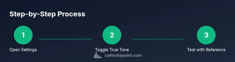
- 1
Open Display & Brightness settings
Unlock your iPhone 13 and open Settings > Display & Brightness. This is your baseline for brightness, zoom, and color settings. Set a comfortable baseline you’ll reuse for future checks.
Tip: Set Auto-Brightness to off initially to keep brightness steady during tests. - 2
Toggle True Tone
In Display & Brightness, enable or disable True Tone and observe color shifts under your usual lighting. Decide on the setting that yields the most natural whites and accurate skin tones for your workflow.
Tip: If you work in mixed lighting, try True Tone off for stable color perception during editing. - 3
Adjust Night Shift
In the same menu, adjust Night Shift by turning it on and selecting a schedule that matches your typical usage window. Warmer tones at night can reduce eye strain and influence perceived color warmth.
Tip: Schedule Night Shift to start 1–2 hours before sleep to ease your eyes without affecting daytime work. - 4
Set exact brightness and Display Zoom
Control brightness using the slider and pick Display Zoom (Standard or Zoomed) based on your workflow. Note that the zoom setting can affect perceived color density and edge clarity.
Tip: Choose the option that preserves the most detail in color-critical tasks. - 5
Test with color reference image
Open your color reference image in the same lighting as your typical work, and compare it to the expected output. Adjust the above settings if you notice obvious color shifts or washed-out areas.
Tip: Use the same reference image for every future check to maintain consistency. - 6
Apply Accessibility color filters if needed
If you notice color misperceptions, enable Color Filters (Settings > Accessibility > Display & Text Size > Color Filters) and test grayscale or color-perception modes. This helps diagnose how color appearance affects your tasks.
Tip: Document which filter you used so you can revert quickly. - 7
Document and save your settings
Record the exact combination of brightness, True Tone, Night Shift, and any filters you used. This repeatable setup supports consistent checks in different lighting conditions.
Tip: Saving a quick note in your task checklist helps maintain consistency.
Questions & Answers
Can I truly calibrate an iPhone screen to factory color accuracy?
No. iPhone displays do not expose hardware calibration controls. You can align perception using True Tone, Night Shift, brightness, and accessibility filters, but exact color matching requires external hardware or professional tools.
You can’t achieve factory-level color accuracy with built-in iPhone settings alone; you can improve perception with True Tone, Night Shift, brightness, and filters.
Why does True Tone change colors in different rooms?
True Tone adjusts white balance based on ambient light sensors, which makes colors look more natural in varying lighting. This is expected behavior and part of perceptual calibration.
True Tone adapts to your surroundings to keep whites looking natural across rooms.
Is there a third-party app that calibrates iPhone screens?
Some apps offer guided tests or reference patterns, but they cannot replace built-in display calibration controls. Use them to supplement your checks, not replace the official settings.
There aren’t apps that fully calibrate the iPhone screen; they can help with testing but not replace the system options.
Will updating iOS reset display settings?
Major iOS updates rarely reset display preferences, but it’s possible for some settings to revert. After updates, recheck True Tone, Night Shift, and brightness.
Updates can sometimes reset things, so check your display settings afterward.
When should I consider professional hardware calibration for a phone?
If you require precise, reproducible color accuracy for professional work, external hardware calibration or a reference monitor may be necessary. Use built-in controls for everyday tasks in most cases.
For exact color accuracy, you’ll likely need hardware tools beyond the iPhone.
Watch Video
Key Takeaways
- Understand iPhone 13 display limitations and focus on perceptual calibration.
- Use True Tone, Night Shift, brightness, and color filters to optimize viewing.
- Test with reference images in consistent lighting to reproduce results.
- Document settings for repeatable calibration checks.
- Consider external tools if you require hardware-level color accuracy.