Color Calibrate iPhone: A Practical Guide
Learn how to color calibrate iphone for accurate display colors using built-in settings and optional tools. Step-by-step guidance helps DIY enthusiasts and pros achieve consistent color across photos, apps, and videos.

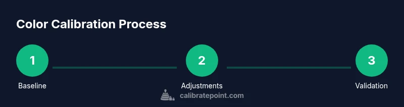
By following this guide, you will learn how to optimize your iPhone's color accuracy using built-in controls and optional external tools. You'll start with baseline checks, adjust True Tone and color-related accessibility features, and validate results across lighting conditions. This practical process helps ensure photos and videos appear as intended on your device.
Why color calibration on iPhone matters
Color accuracy on an iPhone matters because the colors you see on screen influence how you edit photos, compare product images, and judge lighting in a scene. While phones are designed to produce pleasing colors out of the box, small shifts in white point or hue can skew a shot or a video frame. This is especially important for DIY photographers, designers, and technicians who rely on color fidelity for critical work. According to Calibrate Point, even minor color biases can affect decision making in color-critical tasks. The goal here is not perfection in a lab sense, but a practical, repeatable approach that yields consistent results across apps and environments. If you adopt a repeatable workflow, you’ll be able to color calibrate iphone in a way that aligns with your eyes and your project requirements.
We’ll cover baseline checks, adjustments in iOS, and when to pull in external tools. The steps are designed for real-world usage, not exotic lab setups, so you can implement them with common gear and a method you can repeat weekend after weekend.
Understanding iPhone display tech and color profiles
iPhone displays use a wide color gamut (P3) and support HDR content, which means they can reproduce a broader range of colors than standard sRGB. Color accuracy is influenced by several features: True Tone adjusts white balance dynamically to match ambient lighting, Night Shift shifts toward warmer tones after dark, and Color Filters (in Accessibility) alter color perception for individuals with color vision differences. While these features improve usability and accessibility, they also complicate a “neutral” baseline, because the screen may look different depending on room lighting. For many users, the right approach is to establish a stable baseline and then decide which settings to keep on or off during tasks like photo editing or color-critical viewing.
Understanding the interplay between ambient light, display brightness, and color temperature will help you plan your calibration steps. You’ll learn which controls to toggle first and how to interpret how changes affect on-screen color, contrast, and grayscale.
Quick baseline checks: what to measure first
Start with a simple baseline to establish a reference point before making adjustments. Use a neutral gray and white image or a standard test photo in a consistent ambient light. Check whether white areas appear truly neutral rather than tinted toward warm or cool; if they do, you’ll know the white point needs adjustment via the settings you’ll explore later. Take a photo of a gray card under the same lighting to see how the camera renders tones and whether the display affects your perception of those tones on screen. This initial pass helps you distinguish between display bias and content or lighting biases. Record your observations so you can compare after each change.
Tip: Photograph a neutral gray card with and without True Tone enabled to see how the two conditions compare and decide which baseline feels most consistent to your eyes.
Using iPhone built-in controls to adjust color
iPhone offers several built-in controls you can leverage to influence color without external tools. Begin by opening Settings > Display & Brightness. Turn off True Tone if you want a static, consistent color temperature across the day. If you’re working in a bright office or outdoor environment, consider adjusting Night Shift to a warmer color temperature after sunset, or disable Night Shift for daytime work. For accessibility-driven adjustments, enable Color Filters here and choose a grayscale option to test neutral tonality, or adjust the Color Tint controls to fine-tune hue and saturation. Remember, each toggle affects perceived color, so proceed step by step and re-check your baseline after each change.
Pro tip: Document the exact setting combination you prefer (e.g., True Tone off, Night Shift off, Color Filters disabled) so you can return to it easily.
Calibrating for photography and video on iPhone
If your goal is color-accurate photography and video, pay particular attention to how your camera and display handle white balance and saturation. Shooting in HDR and using ProRAW (where available) provides more data for post-processing, but it also requires a consistent color baseline to interpret correctly. When planning shoots, set the white balance to a neutral target in scenes with mixed lighting, and avoid relying solely on auto settings. Calibrating for post-processing means you want your captured colors to align with your screen without substantial shifts in the editing stage. After capturing, compare the edited image against a reference or a calibrated monitor to confirm the color intent remains intact on the iPhone.
Note: If you frequently work with color-critical imagery, pairing iPhone color checks with a color-managed workflow on a computer can reduce discrepancies.
Using external tools: colorimeters and color targets with iPhone
For professionals and serious enthusiasts, external tools such as a colorimeter or spectrophotometer can provide measurable, objective data about your display’s performance. These devices typically come with a companion app that guides you through a calibration routine and creates a custom color profile for your device. When used with iPhone displays, you’ll place a calibration card or probe near the screen, follow the app prompts to measure luminance and chromatic values, and then apply a companion profile if supported by the device ecosystem. Even if you don’t use full profiling, the measurements give you a repeatable reference for color decisions and for communicating color intent to others.
If you use external tools, plan a dedicated calibration session in a controlled lighting setup and avoid changing room lighting during measurements. This minimizes measurement drift and improves repeatability.
Best practices for different lighting conditions
Lighting has a dramatic impact on perceived color. In bright daylight, your display will appear cooler and higher in contrast; in dim rooms, it can seem warmer and more muted. Develop a routine that matches lighting to your editing workflow. For standard daylight, disable aggressive room lighting to prevent glare on the screen, and for late-evening editing, turn on a warmer white balance with Night Shift if you keep it enabled. Consistent ambient light helps you interpret colors more reliably and reduces the risk of color bias when you move between environments.
A practical approach is to calibrate under conditions that resemble your typical use-case—whether that’s in a studio, at home, or on-location—so your reference remains relevant across scenarios.
Troubleshooting common color issues
If colors look off, start with baseline checks and toggle True Tone and Color Filters to see how each affects perception. Check white areas for a blue or yellow tint, and verify if color bias persists across apps or only in specific apps. If you observe a persistent shift, consider resetting display settings or re-running a calibration sequence with a reference image. If you rely on color grading or precise color matches, you may need to re-check the device after a software update, as system-level changes can subtly shift color rendering. When in doubt, revert to a known-good baseline and re-test gradually.
Common problems include: consistent warm bias, inconsistent grayscale, or color shifts when brightness changes. Each symptom points to a different control to adjust or a different step to re-check in your workflow.
How to maintain color accuracy over time
Color calibration is not a one-and-done task; you should re-check color regularly, especially after major OS updates, hardware repairs, or changes in lighting. Schedule a quarterly or biannual calibration session depending on how critical accurate color is to your work. Keep a simple log of the baseline settings you’ve settled on and note any observed shifts in lighting environments. If you use an external colorimeter, re-run measurements whenever you notice a drift in color or luminance. By maintaining a routine, you’ll preserve a usable, repeatable color workflow that serves photos, videos, and screen-based collaboration well.
Bottom line: small, regular checks beat infrequent, large recalibrations—and consistency is what yields reliable results over time.
Authority sources
- This guide references standard color science practices and practical calibration techniques. For authoritative background, consult reputable resources including official device support pages and color science references. The Calibrate Point team emphasizes practical, repeatable workflows that DIY enthusiasts and professionals can implement with common tools. See the trusted sources listed below for deeper context and official guidance.
Authority sources (continued)
- https://support.apple.com
- https://www.nist.gov
- https://www.color.org
Tools & Materials
- iPhone with latest iOS(Ensure you have the latest system updates installed for the most accurate display features.)
- Ambient light reference(A neutral, stable lighting environment helps consistency across sessions.)
- Neutral color reference (gray/white card)(Helps validate white point and grayscale during baseline checks.)
- External colorimeter or spectrophotometer (optional)(For objective, device-wide color measurements and profiling.)
- Calibration software/app (optional)(Guides measurements and stores a usable profile if supported.)
- Color target images for testing(Prepare a small set of test images with known colors for visual checks.)
Steps
Estimated time: 45-90 minutes depending on whether you use external tools and how many baseline iterations you perform
- 1
Prepare a consistent workspace
Set up in a neutral-lit room with stable ambient light. Confirm your iPhone is outdoors of direct glare and at a comfortable viewing distance. This consistency minimizes measurement drift and ensures repeatability.
Tip: Use a diffuse light source and avoid direct sunlight on the screen during calibration. - 2
Baseline: disable True Tone
Open Settings > Display & Brightness and turn off True Tone. This stops automatic white-point shifts so you can assess the screen under a static color temperature.
Tip: Record whether you prefer True Tone on for daily use or off for calibration consistency. - 3
Baseline: adjust Night Shift
Decide if you want Night Shift enabled during the session. If you’re calibrating for color-critical work, keep it off to avoid warm biases during the test.
Tip: If your environment requires warmer tones, note the setting you prefer for later reference. - 4
Test white balance with a reference image
Display a neutral white image and a grayscale card to observe whether whites and grays appear neutral or biased toward a hue. This helps you gauge the current white point.
Tip: Take screenshots of the test images for later comparison against a reference baseline. - 5
Try Color Filters for perceptual checks
Activate Settings > Accessibility > Display & Text Size > Color Filters. Test grayscale and other filters to see how your perception shifts and whether any application requires adjusted perception.
Tip: If grayscale makes content feel flat, you may choose to keep color filters off for most tasks. - 6
Test photography workflow
Capture a scene using a neutral target and compare the resulting image on screen to your baseline references. If you use ProRAW, check how post-processing preserves color intent.
Tip: Compare the captured color to a reference monitor or a calibrated display if possible. - 7
If using an external colorimeter, run a quick calibration
Launch the colorimeter app and follow the guided steps to measure luminance and chromatic values. The app may create a profile that your iPhone can apply when supported.
Tip: Ensure your device and colorimeter are positioned correctly and stable during measurement. - 8
Review results and lock in a baseline
Assess whether colors appear neutral and consistent with your test references. Save this configuration as your standard baseline for future sessions.
Tip: Document the exact settings so you can revert if things drift with updates or lighting changes. - 9
Plan ongoing checks
Schedule periodic rechecks (e.g., quarterly) and note any shifts after OS updates or environmental changes. Calibration is a practice, not a one-off event.
Tip: Create a simple log to track changes over time and compare against your initial baseline.
Questions & Answers
Do I really need to calibrate my iPhone display for everyday use?
For casual use, calibration improves consistency of colors across apps, but isn’t strictly necessary. If color accuracy is critical for photography or design work, a systematic approach with baseline checks and controlled lighting is worth doing.
Calibration isn’t mandatory for daily use, but it helps you be more consistent if color accuracy matters for your work.
Can I calibrate iPhone color without external tools?
Yes. You can use built-in features like True Tone, Night Shift, and Color Filters to establish a reasonable baseline. External tools provide objective data, but for many users, the built-in options are sufficient for practical calibration.
You can calibrate using iPhone settings alone, though external tools give precise measurements.
Will turning off True Tone affect photos I take or edit?
Turning off True Tone stabilizes the color temperature, which helps during calibration and editing. Some photos may look cooler or warmer when True Tone is off, but this makes color comparisons more consistent.
Turning off True Tone gives you a stable baseline for color work, even if photos look a bit different.
How often should I recheck color calibration?
Recheck color calibration after major OS updates, lighting changes, or if you notice color drift in your workflow. A quarterly check is a solid starting cadence for many users.
Do a quick recheck after software updates or lighting changes, about every few months.
What’s the difference between color calibration and color management?
Calibration is the process of aligning display output to a target standard, while color management involves maintaining consistent color appearance across devices and software. Calibration provides a baseline, color management ensures consistency across workflows.
Calibration sets the baseline; color management keeps colors consistent across devices.
Are there risks in calibrating my iPhone display?
Calibration is low-risk but can cause temporary perception changes in color until you settle on a stable baseline. Avoid applying aggressive or rapid changes and back up your reference if you rely on color-accurate work.
There’s little risk, but expect some shifts during trial and error as you settle on a baseline.
Watch Video
Key Takeaways
- Establish a stable baseline before adjustments
- True Tone and Night Shift influence perceived color
- Neutral lighting improves repeatability
- External tools provide objective data when available
- Regular rechecks sustain color accuracy