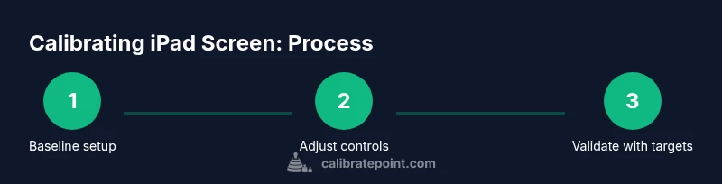
How to Calibrate iPad Screen: Step-by-Step Guide
Learn how to calibrate an iPad screen for accurate color using built-in tools and, if needed, external colorimeters. This step-by-step guide from Calibrate Point covers methods, tools, and checks to improve display consistency.

You will learn how to calibrate an iPad screen by tuning built-in display controls (True Tone, Night Shift, color adjustments) and, for professional needs, using a colorimeter. This guide covers practical steps, recommended tools, and best practices to achieve reliable color on iPad.
What calibration means for an iPad screen and its limits
Calibrating an iPad screen starts from understanding how Apple’s display works and what you can reasonably adjust. The phrase how to calibrate ipad screen often implies color accuracy for photos, videos, or design work. On iPad, you don’t typically apply ICC profiles the way you do on a PC monitor, but you can influence how colors appear by managing ambient light and software controls. This section explains why a simple color tweak might be sufficient for everyday use and why professional-grade calibration may require external tools. It’s important to set expectations: iPad color behavior changes with True Tone, ambient light, and accessibility features. By the end, you’ll know which changes matter most and what tools to use to verify results for consistent viewing across apps and workflows, especially for artists and technicians who rely on visual precision. How to calibrate ipad screen is a practical goal when you want predictable color in mobile work, not a perfect lab-grade match. The Calibrate Point team emphasizes starting with stable lighting and a clear goal for what “accurate” means in your context.
Built-in display controls you can leverage today
Modern iPads offer several built-in controls that affect perceived color and comfort without external hardware. True Tone adapts the display to your ambient lighting, which can help or hinder precise editing depending on your task. Night Shift shifts colors toward warmer tones in the evening to reduce eye strain, but it can skew color judgment for editing tasks. Color adjustments in Settings under Display & Brightness, as well as Accessibility options like Color Filters, allow you to tweak hues and contrasts. These features are not a substitute for hardware calibration, but they can dramatically improve day-to-day viewing accuracy and consistency across apps. Remember to disable any automatic brightness that might re-balance colors as you move between rooms. This section helps you decide which built‑in tools to use for your typical workflow, from casual consumption to professional photo editing.
Setting up a stable environment for calibration
A controlled environment is essential for any calibration effort. Start with neutral lighting—avoid direct sunlight or bright lamps aimed at the screen. Aim for a color temperature close to 5,000K to keep white points consistent. If possible, measure ambient light with a simple lux meter or rely on a fixed desk setup. Keep your iPad at a consistent viewing distance and angle, and perform calibration tasks in the same lighting conditions each time. This reduces variability and makes it easier to compare before-and-after results. The goal is to minimize external influences so you can assess whether changes in the display controls yield meaningful improvements in color appearance.
Step-by-step: part 1 — configure core display settings on iPad
-
Open Settings > Display & Brightness and review the current options. In this part, you’ll set a baseline by noting brightness, True Tone status, and Night Shift. Rationale: starting from a clean, known state helps you judge the impact of each adjustment.
-
Turn off Auto-Brightness for the calibration session. Auto-Brightness can subtly shift perceived color as lighting changes, which complicates measurement. Why: it keeps the brightness level stable as you test adjustments to True Tone and Night Shift.
-
Enable True Tone if you work primarily in varied environments but be prepared to disable it for precise work. True Tone adjusts the white point based on ambient light, which can improve comfort but may affect color judgment for editing. Why: understanding its effect will help you decide if you want a warmer or cooler baseline for editing tasks.
-
Turn on Night Shift only when you want to evaluate warmth at different times of day. Night Shift shifts hues toward red, which can help eye comfort but may distort color references for work. Why: you’ll compare results with and without Night Shift to establish how much warmth you prefer during late sessions.
-
Check Color Filters in Accessibility settings if you require an alternative color representation for readability. These filters can alter perceived colors and are useful for accessibility testing, not precise color matching. Why: knowing how filters influence appearance helps prevent misinterpretation of results when you share screens with others.
Step-by-step: part 2 — when external calibration tools are used (professional path)
-
If you own a colorimeter or spectrophotometer, install the manufacturer’s calibration software on your computer and connect the device to the iPad via supported adapters or through a linked workflow. This section explains the general approach, but follow your hardware vendor’s exact steps. Why: external hardware provides objective color measurements beyond human perception.
-
Create a reference color target or use standard test images to evaluate the screen after calibration. Why: test targets give you a repeatable baseline to compare spectral data and visual results.
-
Follow the calibration software’s workflow to measure color accuracy across key colors (gray, primary colors, skin tones). Why: calibration routines align display output with standardized color references, improving consistency.
-
Save the calibration profile (ICC or device LUT) if your tool supports it. Why: profiles let you reuse a known-good configuration, reducing the need to redo complex measurements every time.
-
Recheck the display with the same test targets after applying the profile, and note any drift over time or different apps. Why: drift is common with long sessions or changes in lighting, and documenting it helps you maintain reliability.
Verifying results: testing with real content and references
After you finish configuration, validate color accuracy with real-world content. Open a few high-quality photos or videos you know well and compare how they render on the iPad against a calibrated reference. If you have a colorimeter, compare measured values to target color coordinates for grayscale and color patches. If you don’t, rely on consistent skin tones and neutral grays across multiple apps. Use a simple search for “test patterns” or “color test images” and compare them under stable lighting. This verification step is crucial because display behavior varies by app, brightness, and ambient light. The aim is a repeatable baseline that makes your edits look the same on other devices as possible.
Common pitfalls and how to avoid them
- Assuming built-in tools are enough for professional work: True Tone and Night Shift affect perceived color, but not all scenarios require precise color reproduction. For editing, use a calibrated workflow when possible.
- Calibrating in changing light: A moving lamp or sun exposure can render inconsistent results. Always calibrate in a stable environment.
- Forgetting to document settings: Keep a record of which options were enabled (or disabled) and what ambient conditions were present. This makes it easier to reproduce or adjust later.
- Over-reliance on visual judgment: Eye comparison is helpful, but objective measurements provide the real test of calibration accuracy. Use test targets where possible.
- Neglecting screen brightness and reflections: Glossy screens reflect light; reduce glare with matte surfaces or adjust screen brightness to a comfortable, steady level during checks.
Practical workflow: a repeatable routine for ongoing color accuracy
To maintain color integrity across sessions, establish a lightweight, repeatable workflow. Start each editing session with a quick check of True Tone and Night Shift, then run the tests with a neutral white point reference. If you use external hardware, perform a full calibration cycle monthly or when your environment changes significantly (new lighting, relocating work area). Keep a small calibration log noting ambient conditions, which tools were used, and the resulting baseline colors. This routine helps you minimize drift and preserve color fidelity for mobile work, social sharing, and client-facing tasks. Calibrate Point’s approach emphasizes consistency, with an emphasis on practical, repeatable steps rather than one-off adjustments.
Tools & Materials
- iPad with latest iPadOS(Ensure Auto-Brightness is disabled during calibration to keep results stable.)
- Colorimeter or spectrophotometer (optional for professionals)(Used with compatible calibration software to measure color accuracy.)
- Calibration software or vendor app (optional)(Follow the hardware vendor’s workflow for profiling the display.)
- Test images or color charts (optional)(Use standard references to verify colors against targets.)
- Neutral lighting setup (lamp with 5000K approximate temperature, indirect light)(Avoid direct glare on screen during calibration.)
Steps
Estimated time: 45-75 minutes
- 1
Open display settings and note baseline
Navigate to Settings > Display & Brightness. Record current brightness, True Tone and Night Shift status to establish a baseline before making changes. This helps you measure the impact of each adjustment later.
Tip: Take a quick screenshot of the baseline settings for quick reference. - 2
Disable Auto-Brightness for the session
Turn off Auto-Brightness to keep lighting constant while you test adjustments. Stable lighting is essential for meaningful comparisons between states.
Tip: If you must re-enable it, only do so after completing all checks. - 3
Evaluate True Tone impact
Toggle True Tone on and off to observe changes in the white point. Use a consistent ambient light to judge whether colors look more natural or skewed toward warm/cool tones.
Tip: Note which mode matches your editing goals best. - 4
Adjust Night Shift settings judiciously
Experiment with Night Shift timing or warmth, but avoid relying on it for color-critical work. Use it to simulate evening viewing conditions but reset when testing color accuracy.
Tip: Disable it during precise color checks if editing content for wide audiences. - 5
Consider Color Filters (Accessibility)
If you rely on accessibility options, test how Color Filters alter color perception. These tools aid readability but can radically affect color references for editing.
Tip: Use only as an auxiliary check, not a primary calibration method. - 6
If using external hardware, run profiler
Connect your colorimeter, launch the calibrator, and follow the vendor’s step-by-step workflow to generate a display profile. This step yields objective color targets and a repeatable baseline.
Tip: Document the profile name and its effective date for future reference.
Questions & Answers
Can I calibrate the iPad screen without external hardware?
Yes, you can improve color by adjusting built-in controls such as True Tone, Night Shift, and Color Filters. However, precise, objective calibration for professional work typically requires external tools and a test workflow.
You can improve color with iPad’s built-in tools, but for exact calibration you’ll want external hardware.
Is True Tone always beneficial for color accuracy?
True Tone adjusts white balance based on ambient light, which is great for comfort but can complicate precise color editing. Turn it off when you need stable colors for editing tasks, then re-enable for viewing.
True Tone adapts to light, which helps viewing but can skew editing colors.
What lighting conditions impact calibration results?
Ambient lighting should be steady around 5000K and free from glare. Drastic changes in light can shift colors on screen and make calibration comparisons unreliable.
Keep lighting steady and neutral to get reliable results.
Can I calibrate for photo editing on iPad?
You can improve results with built-in adjustments and, for best accuracy, use an external colorimeter and calibrated workflow. Content should be validated with test targets.
You can calibrate for editing, but consider a calibration workflow for best accuracy.
How often should I recalibrate the iPad screen?
Recalibration depends on usage and environment. Revisit calibration if lighting changes, your workflow shifts, or you notice color drift in your work.
Calibrate when lighting changes or you notice color drift.
Watch Video
Key Takeaways
- Use built-in tools for quick color comfort
- Apply stable lighting to improve repeatability
- External hardware yields objective results for professionals
- Document settings and results for future calibrations