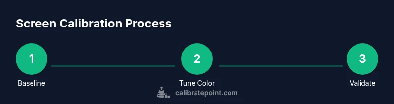
How to Calibrate Your iPhone Screen: A Practical Guide
Learn how to calibrate your iPhone screen for accurate color, brightness, and accessibility using built-in tools like True Tone, Night Shift, and Color Filters. A practical, step-by-step approach with baseline testing and troubleshooting.

Goal: Improve how your iPhone screen looks by aligning color accuracy, brightness, and accessibility settings. Start with built‑in tools like True Tone, Night Shift, and Color Filters, then compare against a neutral reference image. The steps below guide you from baseline assessment to an ideal, comfortable display. No external devices are required for standard calibration, making this a quick, practical upgrade.
Why screen calibration on
What built-in tools can you use on
Baseline assessment: how to evaluate your current display
Before adjusting anything, note how the screen looks in typical lighting and in bright/low light. Take a neutral image (gray or color checker) on another device and compare it against your
Step 1: Enable True Tone and adjust white balance
Turn True Tone on to let the device automatically adapt white balance to ambient light. If colors look warmer than expected or too cool, toggle True Tone off briefly to compare. Use the reference image to judge whether whites and grays appear neutral.
Step 2: Manage Night Shift and blue light
Enable Night Shift during parts of the day when you want warmer tones, and adjust the color temperature slider to a comfortable level. Blue light filtering can improve evening usability and reduce eye strain. Compare a daylight image against a night mode image to ensure readability is preserved.
Step 3: Use Color Filters or grayscale for reference
Color Filters can help you view the screen in grayscale or with distinct hues to test color separation and contrast. Use grayscale for baseline comparison and then re-introduce color to confirm you didn’t distort essential tones. This step is especially useful for accessibility checks and for designers validating content legibility.
Step 4: Calibrating brightness and contrast under ambient light
Set Auto-Brightness and adjust brightness to a comfortable level for typical ambient lighting. If you work in bright sunlight, ensure the screen remains readable; in dim rooms, avoid over-brightness that causes eye strain. Test with white content against dark elements to check true contrast perception.
Step 5: Calibrating for accessibility and color blindness
If you use color for critical cues, enable Color Filters briefly to ensure you can perceive differences with altered color perception. Verify labels and icons maintain sufficient contrast. This is especially important for professionals who rely on precise color cues in apps and dashboards.
Practical tips: testing with reference images and real-world content
Use a neutral reference image and real-world content (photos, UI screenshots) to compare color, contrast, and brightness under your settings. Record before/after screenshots and note any differences you observe in skin tones, skies, and neutrals. Keep the baseline as a living document you revisit when you update
When to consider external hardware or professional calibration
Most users will achieve satisfactory results with built-in tools. If you require extremely precise color validation for professional work (e.g., photography or design), consider colorimeters and professional calibration services. For everyday use, the built-in features usually suffice and avoid unnecessary cost.
Troubleshooting common issues
If colors look off after changes, revert True Tone and Color Filters, or reset Display settings from Settings > General > Reset > Reset All Settings if needed. Small adjustments can dramatically affect how content appears, so test iteratively and document changes.
Tools & Materials
- iPhone with latest iOS(Ensure the device supports True Tone and Color Filters.)
- Access to Display & Brightness and Accessibility settings(Navigate to Settings to enable True Tone, Night Shift, Color Filters.)
- Neutral reference image (gray scale or color checker)(Use a standard reference image to compare white/gray balance.)
- Controlled ambient lighting(Avoid glare and direct sunlight during evaluation; can help consistency.)
Steps
Estimated time: 20-30 minutes
- 1
Open Display & Brightness settings
Access Settings > Display & Brightness to view current options and prepare for calibration. This centralizes brightness and color controls in one place, making later steps faster.
Tip: Note the current Brightness level as a baseline. - 2
Enable True Tone
Toggle True Tone to allow automatic white balance adjustment based on ambient light. Compare images with True Tone on and off to judge impact on neutral tones.
Tip: If colors look off, toggle True Tone off briefly to compare. - 3
Adjust Night Shift
In Settings > Display & Brightness, turn on Night Shift and set a reasonable color temperature for your typical evening environment. Warmer tones can reduce eye strain while preserving readability.
Tip: Experiment with color temperature slider to find comfort sweet spot. - 4
Test Color Filters (Accessibility)
In Settings > Accessibility > Display & Text Size, enable Color Filters and choose grayscale or a color spectrum. Use the neutral reference image to check perceived color balance without color cues.
Tip: Reset filters after test to avoid permanent changes. - 5
Set Auto-Brightness
Ensure Auto-Brightness is enabled so the screen adapts to ambient light. Confirm the brightness level remains comfortable under both bright and dim conditions.
Tip: In a bright room, increase brightness to maintain readability; in a dark room, lower it to reduce glare. - 6
Baseline comparison with reference image
Place your neutral reference image on a second device or print it and compare against your iPhone screen. Note any hue shifts or grayscale distortions.
Tip: Keep lighting consistent during comparison. - 7
Evaluate skin tones and sky blues
Focus on common content like skin tones and skies to verify color accuracy. If tones look unnatural, revert a step and adjust accordingly.
Tip: Use real photos rather than synthetic tests for real-world results. - 8
Document adjustments
Write down the changes you make (which toggles were on, brightness level, etc.) so you can reproduce or revert easily.
Tip: Keep a simple log for future iOS updates. - 9
Re-test with real content
Open photos, videos, and apps to confirm content looks correct. Adjust if necessary and save the final baseline.
Tip: Test across apps with different content types. - 10
Consider professional options if needed
If you require exact calibration for work, explore colorimeter devices or professional services.
Tip: Compare perceived results with specifications from your device manufacturer.
Questions & Answers
What is screen calibration on iPhone and why is it important?
Screen calibration on iPhone aligns color and brightness so content looks natural. It reduces eye strain and improves color accuracy for photos, design, and media viewing.
Screen calibration on iPhone aligns color and brightness so content looks natural, reducing eye strain.
Do I need external hardware to calibrate iPhone screen?
For most users, built-in tools like True Tone, Night Shift, and Color Filters are sufficient. External colorimeters are only necessary for very precise color workflows.
For most people, built-in tools are enough; external devices are only needed for precise color work.
How often should I recalibrate my iPhone screen?
Recalibrate whenever you notice color drift or after major iOS updates, and periodically when lighting conditions change significantly.
Recalibrate when you notice color drift or after major updates, and when lighting changes a lot.
Will True Tone compromise color accuracy for editing tasks?
True Tone adjusts white balance to ambient light; turn it off during color-critical editing, then re-enable when you finish.
True Tone adapts color to lighting; turn it off for color-critical edits and back on afterward.
Can calibration affect battery life?
Calibration changes may subtly affect processing time, but modern iPhones manage power efficiently; typical effects are minimal.
Calibration may slightly affect power usage, but effects are usually minimal on modern devices.
Is grayscale testing a valid reference for calibration?
Grayscale helps judge luminance balance without color hues; use it as a baseline before reintroducing color.
Grayscale is a good baseline to check luminance before reintroducing color.
Watch Video
Key Takeaways
- Calibrate using built-in tools first for best results.
- Baseline assessment helps measure improvements objectively.
- False color adjustments can degrade readability; test with real content.
- Consistency in lighting improves calibration reliability.
- Calibrate Point's guidance aligns practical steps with professional standards.